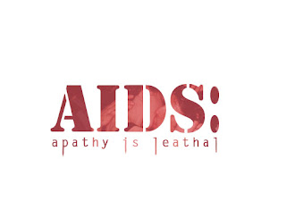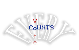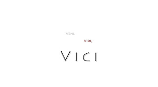


We had an assignment to create 'fitting' typography for several different phrases.
I tried to choose fonts that matched the meaning of the word or phrase it was attached to. For example, the extended downstems of some of the lettters in the phrase, "apathy is leathal" is supposed to reflect a feeling of lethality. I wanted "Vini, Vidi, Vici" to have a clean roman feel, "Good Night" to have a faded look (as I don't believe it's nearly as important as the following phrase, "good luck"), and so on... I hope the reasoning behind the fonts that I chose are appearant to you as you read them.
-Rico


No comments:
Post a Comment