4 years ago
Thursday, December 4, 2008
Just a little credit sequence for a hypothetical... yep, you guessed it... fantasy film! It was done as part of our CIM final project (along with that poster I posted earlier). The song is something I did with a keyboard and garageband, and the visuals were all done in AE (at least the movement and text - and the production logo at the beginning). Enjoy.
Tuesday, November 25, 2008
So part of our final assignment in Computer Image Making is to create an opening credit sequence for a (in my case, hypothetical) movie. To go along with this credit sequence, we must fashion a DVD, along with a movie poster, and all three must be congruent with eachother. Posted below is my movie poster for this hypothetical film, Violent Tribe Spectum (I give my friend, Zan, credit for coming up with the name).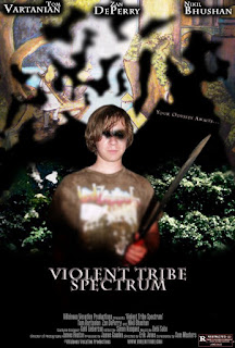

Tuesday, October 28, 2008
DVD Main Menu
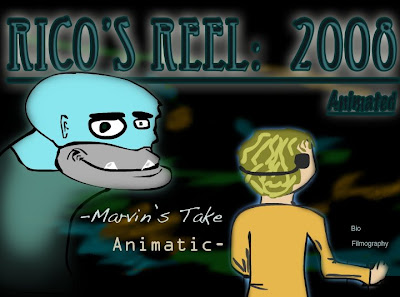
Our next assignment in computer image making is to complete a functioning DVD with multiple menus. This is the main menu, you know, the one you see when you first pop the DVD in. Everyone in the class showed their main menus and received feedback on what we could change to make the menu more effective, and what should stay the same.
As far as positive comments go, the prevailant compliment my menu recieved was on its color pallet and images. The background won a mixed review, as some people said they liked it, while others told me it should change.
Many people commented on the "bio" and "filmography" buttons being too small, but as I did a very foolish thing, and, as I was testing putting this into DVD studio pro, I merged my photoshop layers together - one for the 'background' and onee for 'text' (I gathered this was what we were supposed to do to be able to add actual buttons later on), and like a fool, I didn't save my changes as a copy, so now what I am left with is very little room for change. For example, I received comments taht the title was too hard to read. It would be very hard now to go back and change this, but I played around with pretty much every font I could, and the one I have now is the one I am satisfied with, and I probably would have kept it regardless of my technical quandaries. However, I did recieve feedback on the "animated" part of my title being too dark, which I can and will change (good ol' dodge tool). Someone also pointed out that my edges will be cut off, so I will have to scale everything down before I add it to my final DVD studio project.
Overall, you probably wont see much change, but I will touch it up to add as much clarity as I can, and possibly add a little more to the background (just for the sexy factor).
Thursday, October 9, 2008
Opening credit sequence analysis
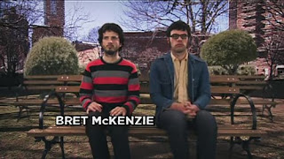
I presented my analysis of the opening to the telivesion show, "Flight of the Conchords", to my computer image making class October 2nd. I talked about the sound/image relationship, the mise-en-scene, the pacing, choice of font, etc... and how it all adds to the meaning of the sequence.
"Flight of the Conchords" opening title sequence
-Rico
Typography
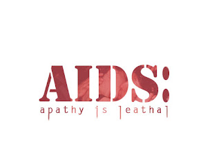
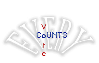

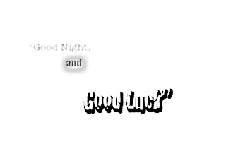
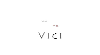
We had an assignment to create 'fitting' typography for several different phrases.
I tried to choose fonts that matched the meaning of the word or phrase it was attached to. For example, the extended downstems of some of the lettters in the phrase, "apathy is leathal" is supposed to reflect a feeling of lethality. I wanted "Vini, Vidi, Vici" to have a clean roman feel, "Good Night" to have a faded look (as I don't believe it's nearly as important as the following phrase, "good luck"), and so on... I hope the reasoning behind the fonts that I chose are appearant to you as you read them.
-Rico
Computer Image Making Photoshop Excercise 1
Intro/Background
I began my studies in the digital arts way back in High School, when I took an after-school class focused specifically on creating art through various digital mediums. My teacher was Trevor Stone, and he instilled inspiration in me to create a vision of the world that can only be seen through the lens of a camera. Is this vision any more, or any less "real" than what we perceive with our eyes on a day-to-day basis? This is one question I hope to address through Jet rik J.
-Rico
-Rico
Subscribe to:
Posts (Atom)


